Colour management for photographers
6. What is colour management capable of and what isn’t it
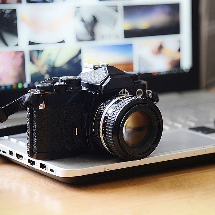
Anyone who tries to make an effort at using colour management, as described in the last article, usually has a specific goal. When I asked (amateur) photographers what they expect from screen calibration and colour management, the most common response was that they want to see the photos on their own computer as others see them on their computers. By this they mean that they want to upload their photos to the Internet and then see how others at home will view these images on their respective monitors.
I must disappoint you if this is your goal. You will never see the photos on your monitor at home the same way that everyone else sees them on theirs. It’s like thinking that everyone else will decorate their living room exactly like yours!
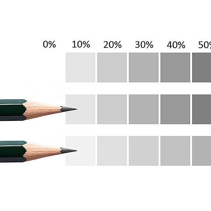
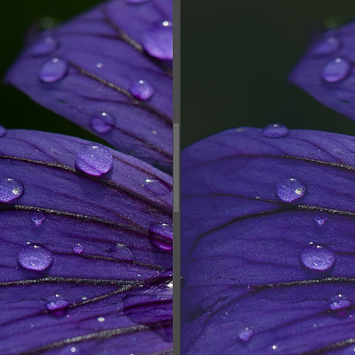
Keep this in mind: The truth is that the colours are displayed differently on every monitor. My EIZO CG and my Surface Pro tablet are both high-quality products and have been correspondingly calibrated, but the tablet’s display simply cannot show the same array of colours that the EIZO can. The tablet lacks some nuances of colour and detail. The difference is immediately visible when I compare images with these colours on both devices holding them side by side. It is even more evident on an office monitor, because often these monitors are capable of showing even fewer colours. If it is not calibrated for this purpose, it will also show differing colours and intensities. What’s more, ambient light and the monitor’s brightness setting also play a role in the expression of the colours.
The colours displayed on monitors will continue to be different as long as everyone uses a different computer. Low-cost monitors will even display the colours differently when you change your viewing angle in front of the monitor. In short, you will never be able to predict how others will see the colours on their computer.
The only thing you can achieve is that your colours will be as similar to those of others who calibrate their monitor and use a browser that supports this screen profile, that is, other photographers or graphic designers who also make an effort to calibrate their system and use software that supports colour management. Your average end user will not calibrate their monitor.
Colour management for a realistic looking print preview
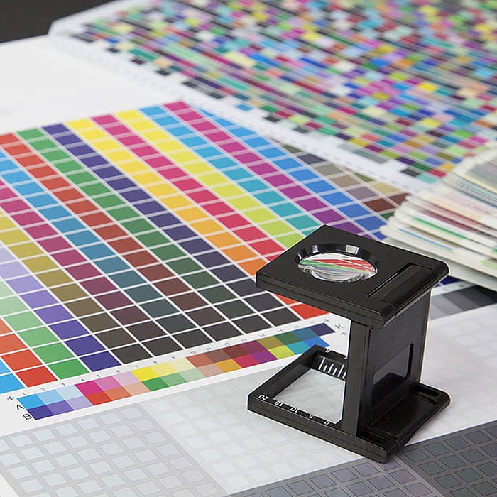
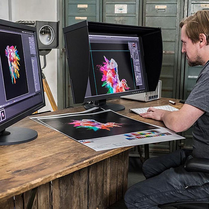
The most important reason to use colour management is when making prints. High-quality prints are expensive, and it is a waste of time and money when you hold the print in your hand and discover that the colours are incorrect or there are details missing. You then discard the print, rework the image and have it printed again. If you print a lot of images, over time you have gained a feel for how the colours need to look on the monitor for the print to be correct. It makes more sense to work with colour management so you can ensure that the colours on the subsequent print will correspond as closely as possible to what you saw on the monitor.
Colour management also requires some practice, but if your colour gamuts are correct, your monitor is correctly calibrated, you have the profiles that match your printer and paper, and all these profiles are supported by your programs, then the colours on your monitor will reproduce a relatively accurate preview of how the colours will look on the printer. Most importantly, you won’t need to relearn everything if you use a different printer later on. Of course, the colours once printed can never exactly replicate what you see on the monitor, because the light from the monitor comes from behind and light is reflected from paper. But at least you won’t be surprised by unnecessary colours, incorrect colours or missing details.
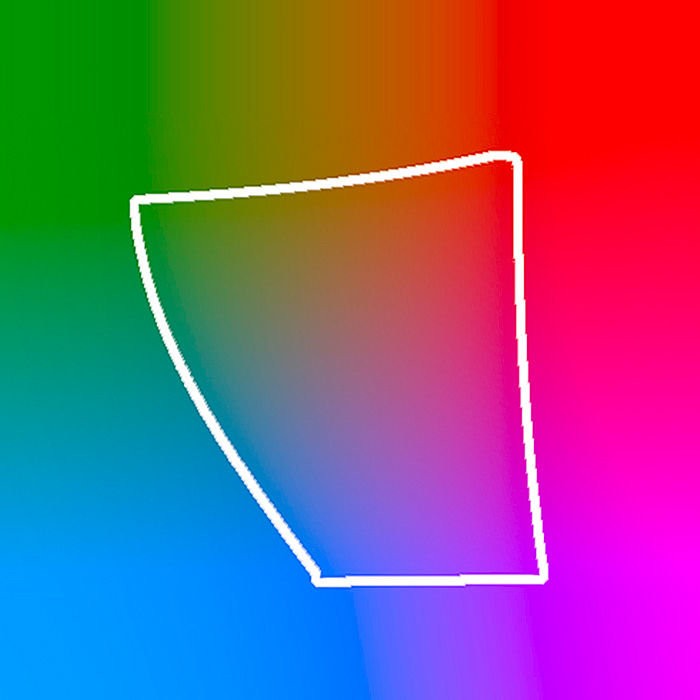
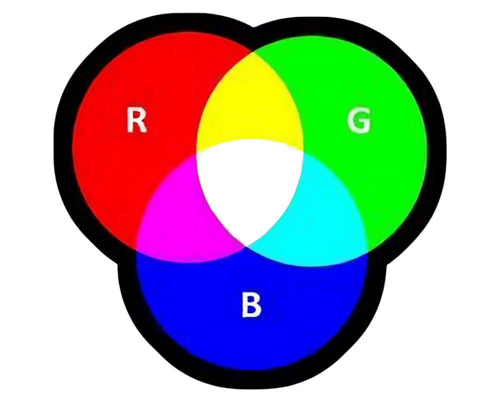
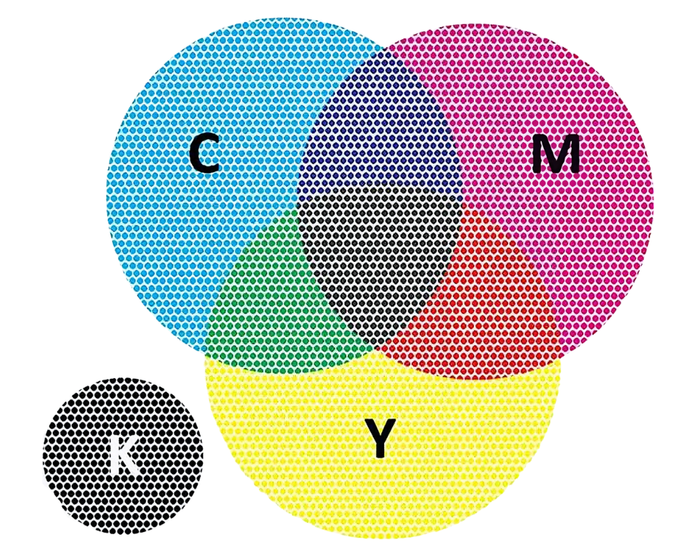
As we have learned in the previous articles, the printer and monitor both work with different colour models. It’s only logical: the printer’s image uses the primary colours of cyan, magenta, yellow and black (and sometimes others) in its inks, while the monitor uses the primary colours of red, green and blue. It means, even if your system is configured correctly and your monitor is calibrated, there are colours that the printer cannot reproduce because its inks cannot. Colour management can help identify areas that might cause problems before printing and target them with soft proofing, which I will discuss in subsequent articles.
More or less colour management
The main job of colour management is to convert the colours for each device in use. You actually assume that colour management is part of every programme that handles photos, but unfortunately this is not the case. In terms of colour management, Lightroom is one of the few nearly foolproof programs. It takes the colour gamuts of the photos into consideration, it uses the colour profile stored in the operating system for the monitor, it outputs the files with a profile and it can manage printer profiles. Other brand-name image processing programs like Photoshop or Gimp can do the same, but you can configure the colour management settings, and sometimes you have to do so manually. You can choose a different working colour space, configuring colour management to apply a different profile from the screen profile. It is very easy to manipulate the settings in these programs such that you end up using completely inappropriate profiles, leading to incorrect colours. In Photoshop you can even set device profiles as a working colour space; however, this is not useful. If you don’t know what you are doing, there are many ways to mess up colour management in image processing programs like Photoshop.
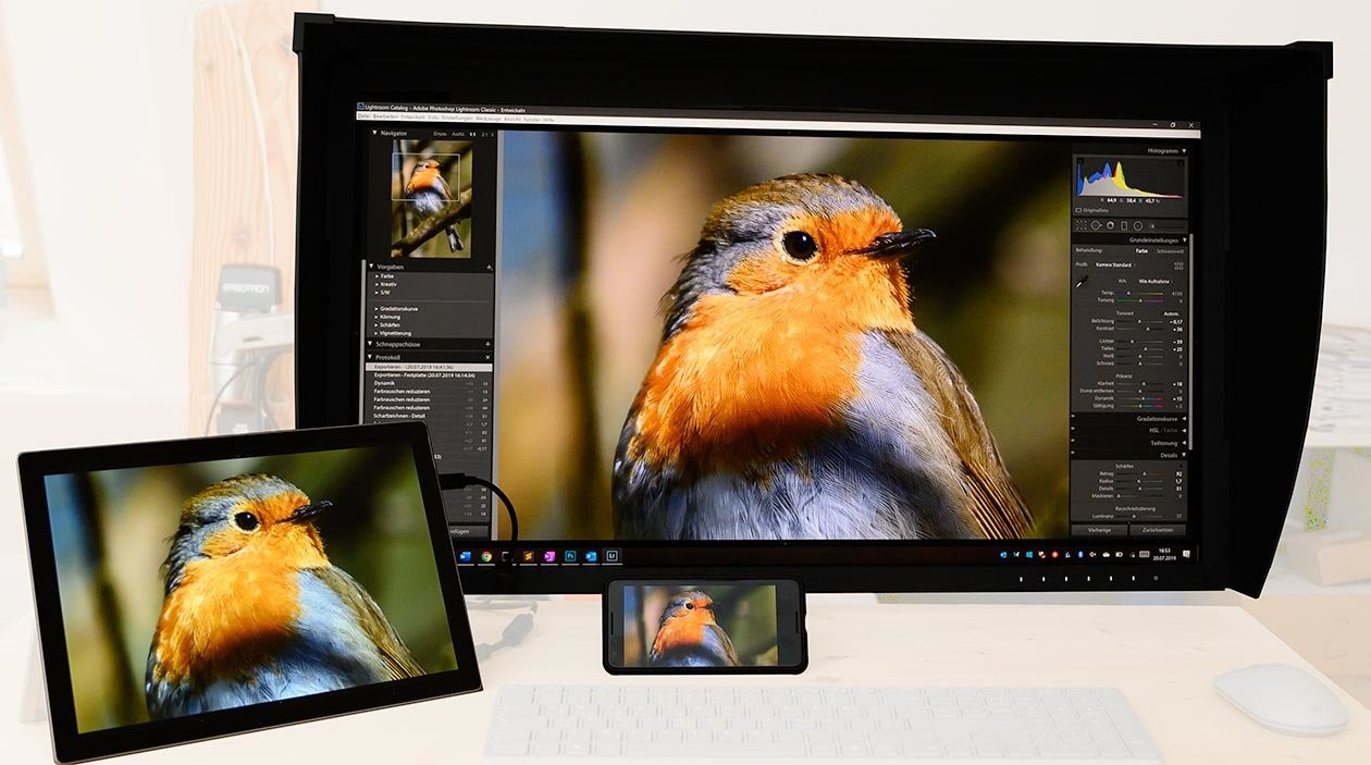
There are a surprising number of programs that only half-way support colour management. For example, the popular IrfanView officially purports to support colour profiles; however, I could not get the programme (in version 4.53) to take colour profiles stored in image files into consideration. And the screen profile support needs to be manually enabled in the settings; otherwise, it isn’t used either. Which is why IrfanView incorrectly displays all colours, as my files rarely use sRGB. Here is an example of a file in the ProPhoto RGB gamut on an EIZO CG with extended colour gamut:
The Windows Picture Viewer supports screen profiles only in the old ICCv2 version. Recent screen calibrations such as my x-rite iDisplay create ICCv4 profiles by default. They are technically better but as the Windows Picture Viewer does not support them, the Picture Viewer will show the wrong colours when such a new profile is set for the monitor. The moment you start using colour management, you should make sure that all the programs you use can handle it.
Equally important: If anyone in the chain reduces the colours to sRGB, the colours will be lost for the time being. So, for example, if you put a lot of effort into preserving the colours, photograph in RAW, work in ProPhoto RGB and send your data in ProPhoto RGB to a printing company but the printing company reduces the colours to sRGB just before printing, then you could have saved yourself the trouble: None of the enhanced colours that you extracted from the photo during editing will then be visible in print, as they are lost when the print file is converted to sRGB. You could just as well have edited the image in sRGB from the outset.
In the next part of the series, I will describe what happens to the colours when they are converted into another gamut.