Colour management for photographers
4. It’s not enough to support colour gamuts
I explained in the last article the differences between RGB gamuts; in this one I want to show the typical problems when working with colour gamuts.
One possible error when processing images with an embedded colour gamut is that the colour gamut is simply ignored. The image will be assigned a different one, which in turn means that the colours will be displayed incorrectly. But even if the printing company takes the colour gamut into consideration, it might happen that it is inappropriately processed by converting the image to another colour gamut.
Unfortunately, you cannot rely on the information provided by the printing company
I ordered a handful of sample photos from a high-quality printing company, among others in ProPhoto RGB, at the end of 2012. When the prints arrived, the colours were correct, but I felt something was missing. The turquoise, in particular, looked dull on the prints. It was as if the company had ignored the extended colours of the ProPhoto RGB gamut. A request on the manufacturer’s Facebook page provided confirmation: The company converted (at least back then) all images it received to sRGB before printing them. Of course, this meant that any advantage you might have had with ProPhoto RGB was lost.
After this experience, I sent test files to various printing companies. The results were sobering: The only company that did not reduce the colours to sRGB or Adobe RGB showed different colours than I would have expected for the colours outside the range of Adobe RGB.
This means, unfortunately, you cannot rely on the information provided by the printing companies. Even if a company boasts that they support the extended colour gamuts, they still aren’t necessarily used to benefit the printing process. And it is impossible to predict with some printing companies when the extended colours will make it into print and when they won’t. Anyone who prints their own photos has a clear advantage here.
A wide gamut also has disadvantages
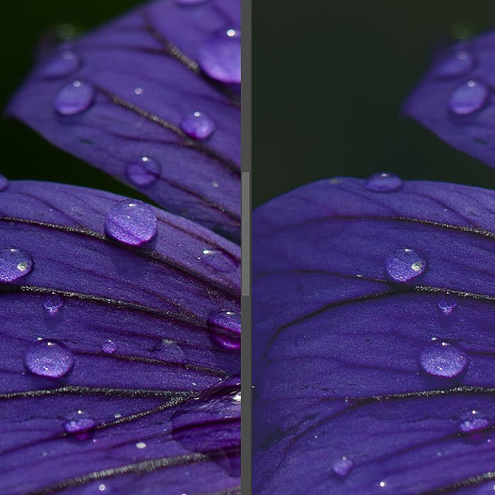
Apart from the fact that relatively few printing companies can use the wide colour gamut of ProPhoto RGB at all, there is another pitfall. If you are using the ProPhoto RGB gamut for image processing, you should work in 16-bit mode. Otherwise, it can happen that colour banding effects will appear, especially in areas of solid colours. I edited one photo quite heavily in Photoshop in the following two illustrations – the one on the left in 16-bit mode and the one on the right in 8-bit mode. In 8-bit mode, the blue gradients have visible banding, sometimes called colour breakups.


This is a slightly far-fetched example, but still it is something you need to keep in mind: The wider the colour gamut and the more you process the image, the more likely you are to work with 16-bit files rather than 8-bit. Lightroom always uses 16-bit mode to process images internally and reduces the data to 8-bit only when exporting. On the other hand, Photoshop usually processes using 8-bit files, where you will need to explicitly convert the image to 16-bit (or get it as a 16-bit file from another programme like Lightroom).
Working with 16-bit files also has its disadvantages: Many Photoshop filters only work with 8-bit images and are not available for 16-bit. Not all image formats can save as 16-bit, so you cannot save a 16-bit image as a *.jpg file because *.jpg only supports 8-bit. And there are hardly any printing companies that can process 16-bit images, so 16-bit images need to be converted to 8-bit before printing (but the colour banding does not come from this conversion to 8-bit, but rather from processing as an 8-bit file – which means you can convert the image to 8-bit for output without hesitation).
I recommend sticking to 8-bit, but keep an eye on areas with solid colours and gradients. If you notice any colour banding in them, you should start over and edit this image as a 16-bit file.
Image processing is affected by the colour gamut
Programs use mathematical formulae to process images internally. These formulae determine how a pixel is changed when it is edited. The working colour space determines what the chromaticity of the pixels means and how this is put into relation with each other. This means that the edits affect the image differently depending on the working colour space. Which is why some retouchers convert their photos to the CIE L*a*b* gamut, since this is essentially the mathematically most neutral colour gamut, process the images using the CIE L*a*b* gamut and then, only at the end, convert to the output colour gamut. I do most of my image processing in programs like Lightroom with which I cannot choose the working colour space. For this reason, I personally don’t use CIE L*a*b*, but some people swear by it (a lot of their training was likely built on this colour gamut).
Which colour gamut for which purpose?
I can derive a few basic recommendations regarding which colour gamut should be used for which purpose based on the differences between the individual colour gamuts. Remember, these are only recommendations. There could be exceptions for which a different colour gamut might be useful for each purpose. However, the following recommendations will generally help you.
Photo prints
I generally recommend using sRGB for these. There are relatively few printing companies that can process colour gamuts other than sRGB, and those that accept Adobe RGB usually convert this to sRGB anyway before making the print. In this regard, there is no advantage in using a wider colour gamut.
Printing at home:
If you have a high-quality photo printer, have the correct profile and your printing software supports colour management, you should use ProPhoto RGB to fully leverage its capabilities.
Fine-art prints
If you have other printing companies making high-quality prints for you, I recommend ProPhoto RGB. While it is likely that the printing company will convert the data to a smaller colour gamut prior to printing, there is a chance that the enhanced colours may be in the print’s favour.
Offset printing
Printing companies usually expect their print data to be in a CMYK gamut, often ISO-Coated V2 CMYK or ISO-Uncoated V2 CMYK, depending on the paper. However, the printing companies with which I have worked so far have all been able to deal with files in Adobe RGB and have converted them to CMYK for their purposes. Adobe RGB is also often used to deliver files to graphic designers.
Internet
I also recommend using sRGB for online publication purposes, since only a very few visitors can handle the extended colour gamuts. If you run a highly specialised site for photographers, you might risk using a different colour gamut, but that would be highly unusual.
Sharing your image files with others
If you are not dealing with a photographer or retoucher who can handle colour gamuts, you should always use sRGB when you share your files with others. ‘Normal’ people rarely have programs on their computers that can handle other colour gamuts. Of course you can share files in any colour gamut if you have other photographers who can also handle colour gamuts. But even with photographers, you cannot assume that every photographer knows or works with colour gamuts.
Slideshow on a projector
I recommend using sRGB if you are planning to present a slideshow on a projector. I don’t know of any that supports something else other than sRGB. And for any other colour gamut you would have to rely on the computer and software on which you play the slideshow to support colour management, which is unlikely. If it’s your own projector and computer and you are sure that the software supports colour management, you could calibrate the projector and use wider colour gamuts for the images.
Selling photos online
You should always provide microstocks with sRGB, although some macrostocks will insist on Adobe RGB, according to Robert Kneschke (author of Stock Photography: Make Money Selling Photos Online).
If you provide someone with images in a colour gamut other than sRGB and the recipient opens them with a random programme, then that programme will probably ignore the colour gamut in the image file and the colours will be different from what you had intended. The bad thing is, no error message will be displayed. No warning whatsoever. The colours are then not as you had intended them to be.
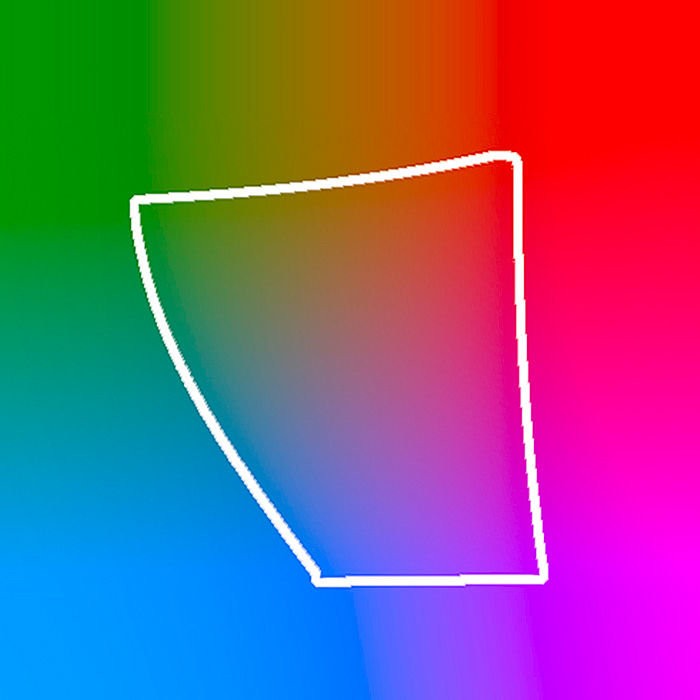
Comparing colour gamuts
It is helpful to get an idea of colour gamuts yourself in order to understand them. You can navigate to the website www.ICCView.de if you want to compare two colour gamuts. To do so, either select one of the colour gamuts listed or upload your own profiles for comparison. One of the colour gamuts to be compared is displayed as a colourful solid body, the other as a grid. In this manner, you can see which colours of the solid body are covered by the grid and which are not. And the whole thing is displayed in an interactive 3D view, so you can use the mouse to rotate the solid body and the grid and view them from all sides for comparison.
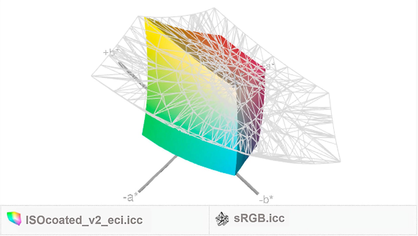
You can see in the above example that the ISO-Coated V2 CMYK gamut can display some colours in the green and turquoise ranges that are outside the sRGB grid model, which is why these colours are lost when working in sRGB. It is especially useful to upload the profiles from your own monitor, printer, camera or scanner and compare them with each other: Which colours can your monitor display that your printer cannot print? Which ones can the printer print that the monitor cannot display? Does Adobe RGB cover all colours of your printer, or should you work in a wider colour gamut? You can use this tool to answer these questions.
I will explain when and how colour management is activated in the next article.