Colour management for photographers
2. Colour models
After explaining colour profiles and gamuts in the last article, I will discuss the underlying colour models in this article.
A gamut is grouped into colour models depending on its underlying basic colours. I learnt the concept of the primary colours in school. There, I was taught that you can mix all colours just using the three primary colours of yellow, red and blue. At least, that’s the theory behind it. In practice, I quickly developed a dingy brown – no matter which colours I mixed together. So it seems that I had a very limited colour gamut with my watercolour paint set.
What I had not learnt is that these three primary colours only apply when liquid paints are mixed together or when non-watercolour paints are used. Years later, when I heard that red, green and blue were the primary colours on televisions and monitors, I thought they were mistaken and that it had to be yellow instead of green. It was only when I heard about the primary colours of cyan, magenta and yellow used in the printing world that my world view imploded, and I finally realised that there were other primary colours than those I had learned about in school.
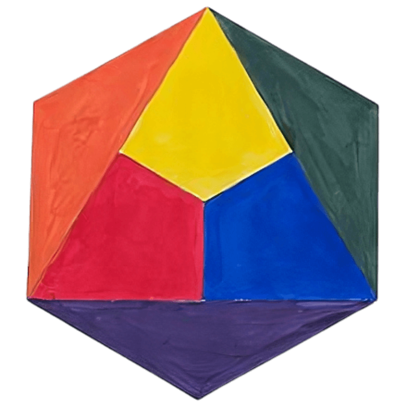
Since I mentioned school: Maybe you remember the colour wheel (according to Itten) that you had to fill in using your watercolour set in school. For me it was very educational to paint this colour wheel using a cheap set of watercolours initially and then again using an expensive one. The paints mixed together as expected with the expensive set; however, with the cheap set of watercolours, even the simple colours, when mixed, looked dingy. It seems that the cheap set of paints had a very limited colour gamut that you could produce using it. It’s no different with computer monitors. Cheap ones often do not reproduce the colours as clearly as expensive ones, unfortunately.
YRB – the primary colours of the major (and minor) painters
Yellow, red and blue – the three primary colours – are of interest for painters still working with actual brushes. For photographers or those working on the computer, however, the primary colours have no practical meaning. These stand in contrast to RGB, which stands for red, green and blue.
RGB – the primary colours of digital design
The basic colours of televisions, computer monitors, photo labs, photo printers, digital cameras as well as those used by digital photographers are red, green and blue, or RGB. In the absence of colour, the background is black, like a television that is switched off. A camera works in a very similar manner. The image remains black if no light falls on the camera’s sensor. The primary colours mix together with all other colours. On the other hand, when absolutely all colours hit the sensor, the image is white.
RGB is used wherever light rays are mixed together to form an image. The more rays of light that come together, the brighter the image becomes and the more the colours tend towards white. This is called ‘additive colour mixing’. YRB as well as CMYK are used for colour on paper (or any other tangible material). The more colours are added there, the darker the result of the mixing becomes, the more it tends towards black. This is called ‘subtractive colour mixing’.

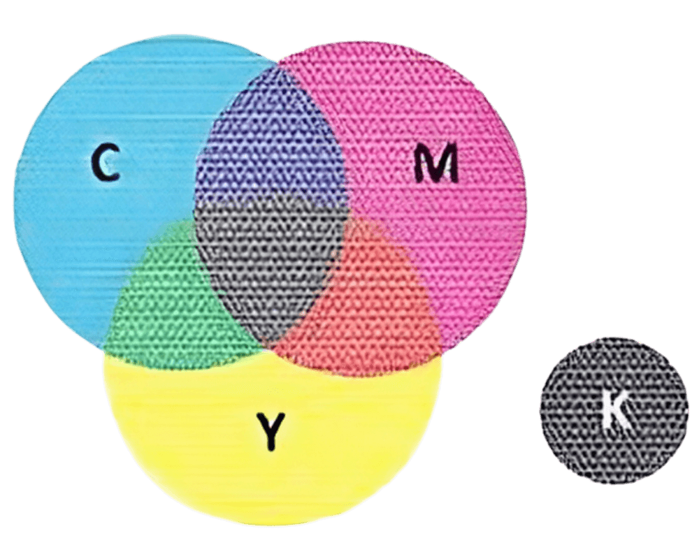
CMYK – the primary colours of graphic designers
Colour printers and large printing presses use the primary colours cyan (C), magenta (M), yellow (Y) and black (K) to mix all other colours. The mixed colours are not mixed together before printing, in contrast to painting. Instead, very small dots of the primary colours are placed next to and on top of each other, producing the desired colour effect. Black is taken as the fourth colour, because it is not possible to cleanly mix black from cyan, magenta and yellow (nor, as an aside, from the yellow, red and blue of my watercolour set from school).
Photographers generally have little to do with colour gamuts in the CMYK model, unless they are preparing data for offset printing. CMYK is more for graphic designers. Even photo printers usually expect to receive their print data in RGB and then convert it themselves to use with their colour inks, especially if they use more than these four basic colours. Even the photo labs that develop digital photos work with RGB and not CMYK.
This once happened to a graphic designer who prepared my photos for fine-art prints on postcards to be printed on a high-quality photo printer. She made the mistake of converting the images to CMYK, just as you would do in offset printing. Unfortunately, this dulled the colour of the prints. The quality of the photos suffered greatly when they were converted to CMYK and processed further by the printer driver, which was expecting RGB.
I will not go into the different CMYK gamuts since photo printers and developing machines expect to receive RGB. For more information about the CMYK gamuts, I recommend looking into books directed at graphic designers, such as Grafik und Gestaltung [‘Graphics and Design’] by Markus Wäger.
If you prepare data for use in printing, you should make sure when you buy a monitor that it covers as much of the ISO-Coated CMYK gamut as possible, like the EIZO ColorEdge series of monitors. You can only reliably judge the colours if your monitor displays all of them.
Photographers often only talk about the CMYK colour model, and almost never mention a specific colour gamut in this colour model, such as the ‘ISO-Coated V2 CMYK’ gamut, a common CMYK gamut for coated paper, which only exemplifies how little CMYK is used by photographers.
CIE L*a*b*, HSL, etc. – the ‘others’
There are dozens of other mathematical means to describe gamut, in addition to the standard colour models. Each of them has its own area of application for which it was developed. Some retouchers swear by working with the CIE L*a*b* gamut. Yet, this is a special topic that would go beyond the scope of this book. Apart from that, I think these colour models are unimportant for the photographer.
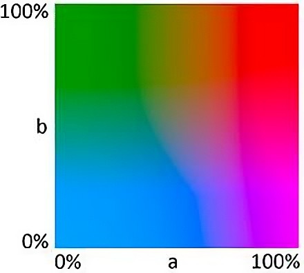
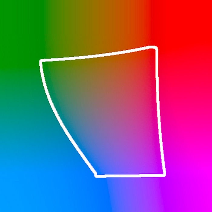
Later in the book, I will use the CIE L*a*b* gamut to show differences between sRGB and Adobe RGB. Here, I will simply introduce it. CIE L*a*b* is based on three basic values: L* stands for luminance, that is, brightness (from black to white), a* and b* stand for two seemingly random colour axes (red to green and yellow to blue). Each colour can be represented by a combination of a value for a and b and then changed in brightness via L*. If I set L to 50%, I can represent all colours at 50% brightness in one box. But neither a printout nor a monitor can show all colours that are contained in CIE L*a*b* in theory. For this reason, the corners show large areas in a uniform hue, but in theory these would be colour gradients.
I will use this representation of CIE L*a*b* in the following article to make a comparison of the scope of colour gamuts and profiles.