Colour management for photographers
12. Soft proofing in Photoshop
While Lightroom offers very few but mostly useful settings for soft proofing, Photoshop offers countless setting options, including some that it is better not to use as they can lead to incorrect results.
The working colour space
In Photoshop, you can set suggestions for working colour spaces in the menu under Edit > Colour Settings. The RGB gamut is of particular interest to photographers. Here, you should choose between sRGB, Adobe RGB and ProPhoto RGB. Confusingly, Photoshop offers many further profiles here, including the installed printer profiles. This misleads novices into setting the printer profile as the working colour space for printing. They then wonder later on why the soft proofing looks so wrong (especially when they compare it to the display in Lightroom). It makes sense to select sRGB, Adobe RGB or ProPhoto RGB as the working colour space. If you occasionally edit photos for offset printing, it is also a good idea to select the printer’s preferred gamut as the CMYK gamut. In my case, this is PSO Coated v3.
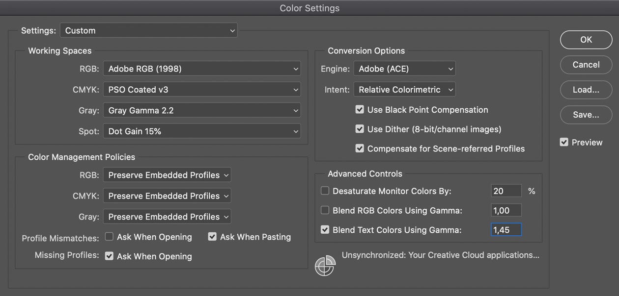
The gamut set in the colour management policy is only a suggestion, and so I can still edit images in any gamut. The setting that makes Photoshop keep the embedded profile when opening a file is more useful for me as I edit photos in different gamuts depending on the application. The conversion options are used when, for example, I copy a section from an image in the sRGB profile and paste it into another image in Adobe RGB. Then Photoshop asks me whether I want to convert the image data (of course I do) and uses the conversion options set here.
An interesting approach to artificially extending the gamut of the screen is to reduce the saturation of the monitor colours in the advanced settings. Although the colours will no longer be correct and will be weaker, you will see more details in the saturated areas. This can be useful under certain circumstances, provided you are aware of this effect. I’ve not used it so far, because my Eizo screen covers a very large colour range.
The ‘Blend RGB Colours Using Gamma’ and ‘Blend Text Colours Using Gamma’ options are not directly related to colour management and are of interest if you are assembling compositions from many images. They have no effect on my work, so I leave them at their default values.
Setting up soft proofing
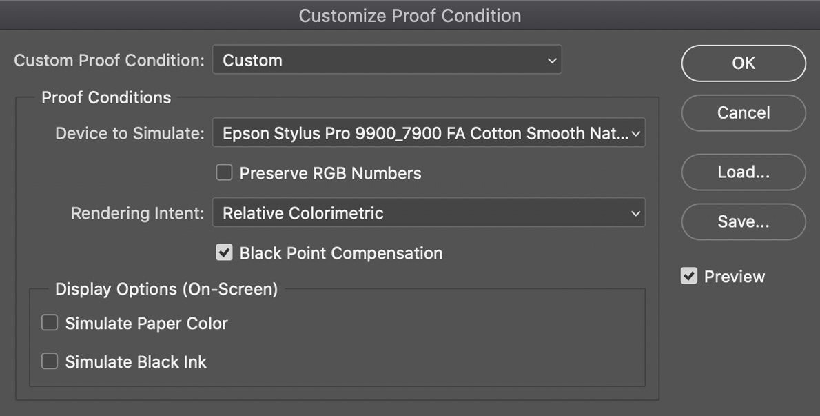
Once you have opened your photo, you will find soft proofing in the menu under View > Proof Setup > Custom. Don’t be confused by the dozen or so other menu items below. Some sound promising, such as Monitor RGB, and you could think that they might help you, but they are all just siren calls that will drive you to despair if you try to use them!
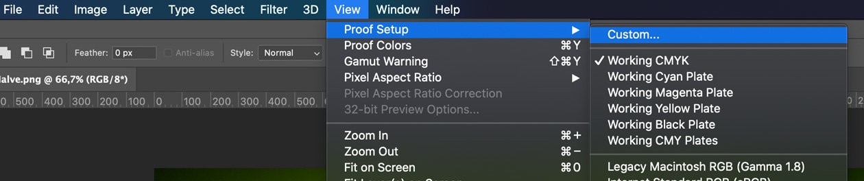
In addition to Custom, the Working CMYK option is also worth mentioning. This takes the CMYK gamut set in the colour management policy as the target for soft proofing.
But be careful: Even when you select Custom, there are options that allow you to make the soft proofing view show colours in low quality. Preserve RGB Numbers should never be active and Perceptual or Relative Colorimetric should be set as the Rendering Intent. Saturation is for business graphics and Absolute Colorimetric is for hard proofs. Black Point Compensation should remain activated to ensure you can work reasonably and the Display options should remain disabled. The latter, like the paper simulation in Lightroom, are only useful if you want to compare your photo with a print. Here (and only here), you select the profile for the printer and paper.
Once you have set up soft proofing, you can turn the display on and off by selecting View > Proof Colours or pressing [Ctrl+Y].
With soft proofing switched on, you can now edit your photo in Photoshop as usual until you like the colours and details. Here are a few tips and tools for editing in Photoshop:
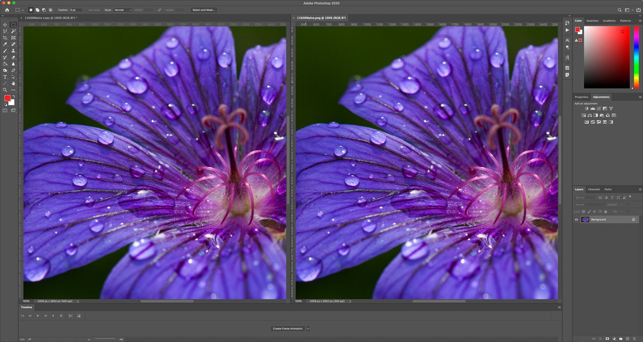
Displaying proof next to the original
Sometimes it is helpful to compare different versions of a photo. To see them side by side, first open the same picture a second time by selecting Image > Duplicate (do not save the second picture – it is only for viewing it next to the first one). Now select Window > Arrange > 2-up Vertical so that you can see both at the same time. Select the required section in an image to work on and then select Window > Arrange > Match All to get Photoshop to show the same section in the second photo. You can now activate soft proofing in the window you are working in and leave it deactivated for the copy, so that you can see the screen version next to the proof version.
Photoshop offers tools to selectively change or tone down individual colours that are oversaturated. I make the adjustments via layers. For example, I would slightly adjust the hue for this photo for this printer hue/saturation and desaturate it a little so that the details do not disappear.
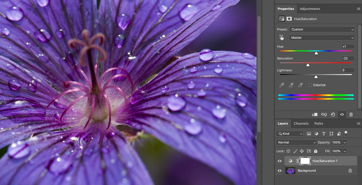
You may also use a gradation curve to lighten the shadows slightly. You can combine the adjustment layers in a group and take the printer and the paper for which these adjustments apply as the name for the group, so that you also know later on for which printer and which paper you have edited the proof. In addition, this ensures that the original image remains unchanged. You can switch off the layers with the proof adjustments at any time as required.
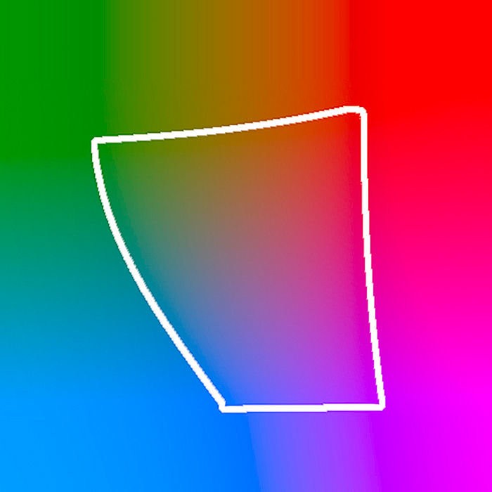
You can also use Gamut Warning in Photoshop to see which areas are causing problems in your image. This is located on the View menu or can be activated by pressing [Ctrl+Shift+Y]. In this Gamut Warning, Photoshop displays all the colours that cannot be shown in grey (of course, they do not look grey in print, but look the same as in soft proofing). These areas are likely to lose details in print and should be examined in soft proofing.
Printing
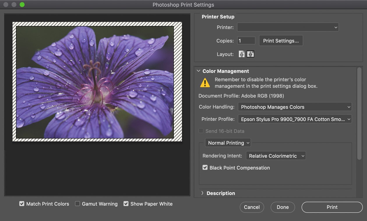
When printing, I recommend letting Photoshop take care of colour management. For this purpose, you need to deactivate colour management manually in the printer driver and set ‘Photoshop Manages Colours’ in the Print dialogue under Colour Handling. Otherwise, the colours will be passed to the printer driver for printing in sRGB by default. This means that colours outside sRGB would be lost for printing and the preparation with soft proofing would have been a waste of time.
Forwarding to printing company
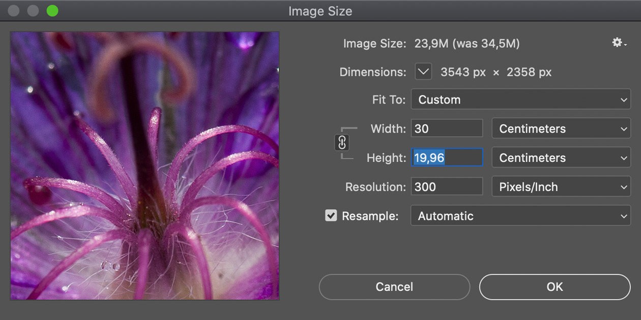
If you forward your file to someone else for printing, you should first convert the image size [Ctrl+Alt+I] to the desired dimensions in cm and the resolution (usually 300 ppi) required by the printer.
Finally, save the image in a format that is suitable for the printing company (high-quality JPG is the least problematic) and transfer the print file to the printing company.